

Augmented Reality on Web
A race to be first
In early 2019 there was a small race in the E-commerce world to be first to market with an Augmented Reality solution that would work on some of the top web browsers. For several years prior to that Ecom sites had AR, but only for their native Android and Apple apps. However, the data for several years has suggested that customers download fewer and fewer mobile apps and tend to do their Ecom shopping on a mobile web browser.
So, with that in mind, my team and I were tasked with working with a start-up in the Utah valley that would allow us to get AR on both Chrome and Safari within about a month in order to showcase it at an upcoming conference and be first to market.
EMPATHIZE AND DEFINE
First, we needed to understand why a customer might want to use an AR feature on mobile web. We did some research using Baymard Institute’s Wiki (the leader on Ecom research) and met with some customers over video conferences to better understand how they shop today.
Learnings
We learned that AR might not be the first place a customer goes to make an informed buying decision on a product detail page, but it certainly could help. Reviews and photos remained at the top of most customers lists as being influential.
Flows
Second, we needed to understand all the various ways a customer may want to enter into the AR feature. So I and the tech lead sat down to better understand the flow. These helped when it came time to develop and how we would handle messaging on desktop.
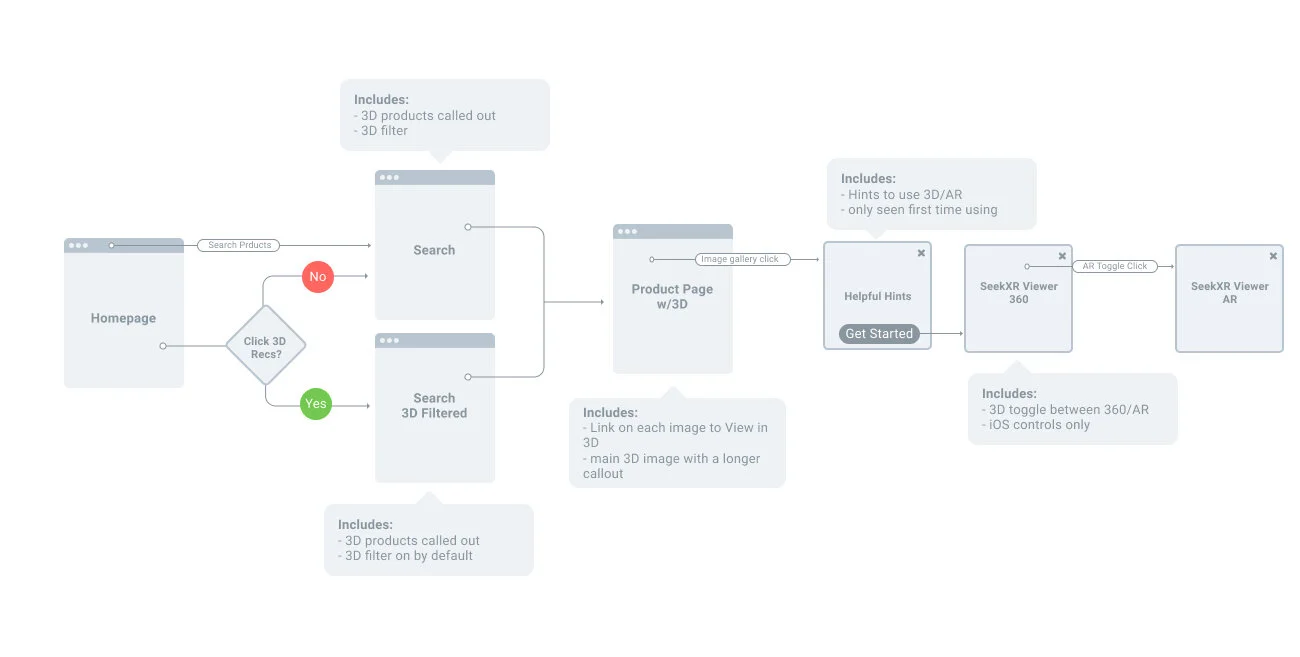
Flow for a Safari web experience
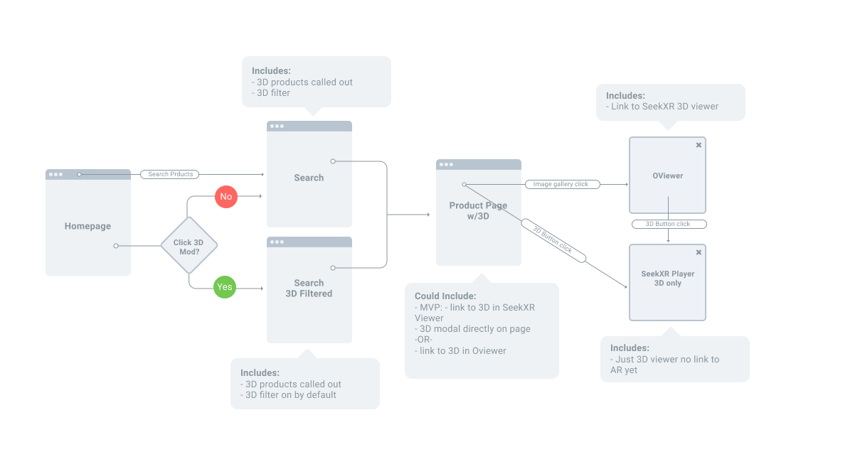
Desktop flow for most browsers. Customers would have the ability to view a 3D render, but not AR, so messaging and flow needed to be accounted for.
IDEATE — PROTOTYPE — Test
We knew that we would need an icon to display in our search and on our product details page and we knew many Ecom sites already had AR on their native apps so we started by auditing various competitors’ mobile apps and other AR experiences in the Ecom world. We looked into Wayfair, Houzz, Lowe’s, and Home Depot just to name a few.
Takeaways
most used a distinct icon, typically in their brand color to denote a 3D or AR experience in multiple places throughout their site
the technology still tended to be a bit cumbersome but was usable
many featured the ability to add the item to a cart right from the AR viewer
some included helpful hints or how to’s for the AR experiences specifically
most were also accessible from the product details photo carousels and launched in an overlay
USER TESTING
Icon Testing
All of these audits formulated the idea that we needed to determine which icon we could use universally to represent this feature. It needed to be recognizable for both a 3D and an AR type of experience. After a couple of rounds of remote user testing, we came away with the understanding that the simple ‘3D’ icon would be the most recognizable to people to indicate this.
Tag Language Testing
We also knew we would need the icon to work with a tag component as well on the product image on the product details page. So we tested several different 3D tag language lock-ups and came away with the learning that ‘3D Interactive Viewer’ was the clearest to our participants.
AR Demo Testing
We also tested the usability of the feature using the 3rd parties demo site with their test inventory. We wanted to see real-time what some users may face as they try to use this new feature that was still somewhat buggy. We found that overall participants had a positive experience with the demo, but indicated a few more instructions on how to use the AR feature would be helpful since some of the pinch and zoom and rotate gestures were slightly different than expected. Others indicated it would be helpful to have a way to see how big the item was in their space through some sort of scale or percentage.

Houzz native app audit.

Demo screenshot from the user test. This participant struggled to place a chair in her small space. You can see it very small near her finger.

Multiple design iterations of an icon and tag to represent the feature in various places.
Final MOCKs for Dev

Mobile homepage banner ad for the new feature.

Desktop banner ad mockup.

Icon and tag in context of the search and product details page.

‘Helpful Hints’ page and the MVP of the feature with HIG native buttons that the 3rd party company used.
TEST
Because of our quick timeline, we wanted to move forward with an A/B test to get it into the wild. We started by launching on Safari mobile and desktop web 50/50 traffic.
Results
We saw a small lift in conversion on the pages that had AR, around .5%. We knew the 3rd party we’d been working with was planning to add more features and ultimately it wanted to also explore 2D type of experience for rugs, which was our largest seller. With these results, it was determined to keep the feature going and continue to iterate. We also ramped up the launch to 100% of traffic for Safari and launch Chrome mobile and desktop as well.